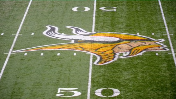
Fans were asked to pick the best logos in the NFL and based on their response the Minnesota Vikings Norseman head as the fifth best in the league.
The Minnesota Vikings have tinkered with their Norseman head logo a bit over the years, but the blonde-haired, helmeted pillager has represented the team since the team’s inception during the 1961 NFL season.
Created by Los Angeles Times cartoonist Karl Hubenthal, the logo was meant to represent a Scandinavian warrior which is fitting considering the high concentration of people from Denmark, Norway, and Sweden in Minnesota according to Sports Logo History.
Since then, color has been added to the face of the logo and the hair, the horn color has changed, and the detail in the horns and hair have changed, but the spirit and recognition of the logo have remained the same.
Recently, FanJuicer.com polled 1,488 fans to find out what the best logo in professional football is, and the Vikings logo landed in the fifth spot on their list.
Eugenie McLellan, the graphic designer they asked to talk about the logos, saw a lot of things to like about the logo, including its masculinity, strong outline, and implied features.
"“It is very manly, which is great for football. It’s not my personal style, but from a design standpoint it is well done, and I can understand why it may be one of the higher ranked ones. The outline of the figurine is great and sends a distinct message. He has a strong jaw and facial features, and I really like the implied shape of his shoulder – that creates a nice effect.”"
Still, there were some things McLellan didn’t like. The designer in her saw difficulty in surrounding the logo with text and some issues with his own personal design preference keeping her from enjoying it to the fullest.

Minnesota Vikings
"“I imagine it might be difficult to fit typography under the logo with this braid sticking out. There’s quite a few shapes sticking out from the central figure, but again, my hangup with that is personal preference. Regardless of any of my hangups, it still feels classic, and I mean that in a good way.”"
Here are the four teams who were voted to have a better logo than Minnesota by fans:
- New Orleans Saints
- Detroit Lions
- Atlanta Falcons
- Los Angeles Rams
Interestingly enough three of the teams above the Vikings feature animal logos with the same kind of features sticking out as Minnesota’s logo has, but may have landed in a higher spot on the list due to preference in color scheme or due to animal lovers.
To round out the NFC North, the Green Bay Packers logo was viewed as being ‘below average’ in the 20th position and the Chicago Bears were ranked 28th with one of the worst received logos in the survey.
Next: 7 best moves of the Vikings' 2018 offseason
There’s a good reason so many fans are proud to wear Minnesota Vikings apparel. Whether it is on a hat, shirt, jersey, cup, or any item imaginable, fans can take pride in knowing they have one of the best logos in the NFL to show their team pride wherever possible.
